Thursday, May 12, 2011

Life by me.


Lifebyme.com is about sharing meaning. They ask one question to all sorts of people: "What is most meaningful to you?"

The idea is to connect with world leaders, moms, Nobel Peace Prize recipients, fishermen, teenagers, designers, prison inmates, media moguls ... you? Check it out here.


Monday, May 9, 2011

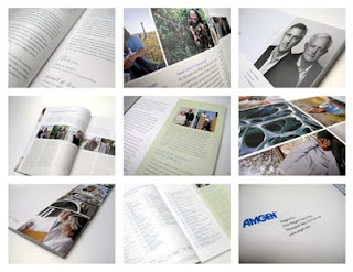
Amgen Annual Report 2010


This is the fourth year in a row we've collaborated with Amgen on their corporate Annual Report. It's a highly visible piece that not only communicates their progress to stockholders, but is also a great opportunity to provide an in-depth look into the company, its missions, values, and goals. So our approach, as with all of their projects, is to have a good understanding of what they're all about, and come up with a design that speaks to every aspect from research and development - all the way to helping patients.

Team included:
Jen Hopkins/Senior Designer
Clare Calderone-Markie/Account Director
Shannon Wright/Art Buyer.


Friday, April 8, 2011

Lakeside Real Estate Group: Re-brand

Founded in 1989, Lakeside Reality is a real estate and commercial land development and realty firm based in Tellico Village, Loudon County, Tennessee, just south of Knoxville. Although Lakeside was originally established under the large ERA franchise, this February the company was purchased and is now privately held under a new name, Lakeside Real Estate Group. To accompany this purchase, we were given the initiative to rebrand, reinvent and differentiate Lakeside as a fresh, modern company to the community.

Our objective was to create a real estate brand that feels contemporary, but still holds the traditional aesthetic value relevant to the southern community. We explored colors that would contrast the conservative look of the past ERA franchise; ERA's colors, process blue and PMS 199 red, are a trademark of 80's corporate America. We looked to the community, especially the blue waters of Lake Tellico and the red hills of the smokey mountains, for color inspiration. For the imagery, we simplified everything to evoke a sensory, emotive and natural feel.

Ultimately, we wanted the Lakeside Brand to represent a symbol of experience as a confident company.
We felt that this confidence should be reflected in all media touch points and visual communications, including Lakeside's website, brochures, business system and every form of signage. Here's what we came up with:


Monday, April 4, 2011

Tea Stack


For the love of packaging and tea! Check out Peskimo's Tea inspired illustrations!

The Dieline

Tuesday, March 1, 2011

Who is Adrienne Ford?

All the way from Atlanta. Our spring and summer Intern from Emory University.
Adrienne has local roots and we're happy we found her.

Hometown: Agoura Hills, CA


Age: 20


Job at Saputo Design: Design Assistant


Favorite food: Pasta! All day everyday


What color do you identify yourself with most: Bright blue


Favorite animal: Puppies


What Mario Bros character are you: Princess Peach :)


Who are your heroes in real life: My dad


What makes you happiest: Sleeping in, eating, designing, laughing.


What do you like most about Saputo Design: The lack of having to use Microsoft Office... and everything else! I love working here- there are amazing people and interesting things to do.