Wednesday, August 3, 2011
Who is Jennifer Hopkins?
A short interview with the talented Jennifer Hopkins.
Name: Jennifer Hopkins
Position: Senior Designer at Saputo Design, Inc.
How did you become interested in design?
I took a bunch of classes at junior college, and the one about design was the one I loved the most. I just liked all the type!
What's your favorite band?
The Pixies.
If you could meet any celebrity, who would it be and why?
Right now, it would have to be Nathan Fillion - because he's a dork.
If you could have a superpower, what would it be?
The ability to freeze time. Sometimes, you need a break!
What's your favorite part of working at Saputo?
The people.
One word of advice for designers?
To be confident in what you do - it goes a long way. That and drink lots of coffee!
Glasgow 2014 Pictorgrams
For each Olympics, a graphic design team is given the initiative to reinvent the pictograms used to depict each Olympic sport. For a global campaign such as the Olympics’ pictograms, icons have to be simple enough to be understood by a world audience, but must be aesthetically pleasing to a wide variety of different people from vastly different cultures. Needless to say, it’s a difficult job.
This year, according to this article by Creative Review, the pictograms for the Glasgow Commonwealth Games in 2014 were unveiled last week by studio Tangent Graphic. These pictograms have a more simplified look that feature double lines, as well as different line weights, to emphasize certain key parts of the icon. While we think that they are different and definitely creative, our absolute favorite icons were from last year’s Vancouver Olympics – take a look at the genius here.
Monday, August 1, 2011
Webinspeer
HTML is still just a child and we’re only beginning to see what it is capable of. Not only is this a collection of great looking websites, but they also exemplify the potential of HTML. As browsers become more powerful, we will only see more and more of this type of creative design. Check it out!
Satellite Collections
Take a look at this article about artist Jenny Odell’s work, Satellite Collections. She manually scans Google maps, collecting different types of man-made objects and arranging them together to form a beautiful piece of art.
According to Odell, “they’re things we often overlook or take for granted as part of our environment; but somehow, from a satellite point of view, they reveal themselves to be (somewhat) ubiquitous signs of human civilization, popping up in certain places while the surrounding area may simply be desert or mountains. From this perspective there’s something very fragile and nostalgic about them.”
What an imaginitive way to combine nature, humanity, and the omnipresent technological age.
Thursday, July 14, 2011
Newbury Park Girls Softball Team T-Shirt
For an 8-year old girl, softball isn't just about stealing bases and hitting home runs. It's about friendship, pizza parties, sunshine, getting stung by a bee... all the little things. That's why when we got the assignment to make a t-shirt for the Newbury Park Girls Softball Team, we didn't want to make your typical sporty, jersey-inspired shirt. We wanted something different and representative of everything that goes on in a little girl's life - something with a little more heart.
Wednesday, July 6, 2011
Pasta Girl Logo
Mom, now in her mid-eighties, never really kept an organized recipe book or measured ingredients for her dishes. Instead, her measuring methodology included a "a handful of this," or "a pinch of that," and the usual "I add until it tastes right - stop asking so many questions Tommy and get out of the kitchen." So while mom’s tastes have changed over the last few years and she has forgotten most of the ingredients, Nina has been transcribing and cooking each dish in a slow trial and error experimentation to figure out the contents of each recipe. She will then turn them into a family recipe book that will eventually be published under the Pasta Girl brand name.
As for Pasta Girl's identity, the creative approach was almost a no brainer when it came to, if you will, a creative a strategy. Mom had to be the icon of the brand. It was an emotional inspiration stemming from the images of our childhood; a large Italian-American family consisting of Mom, Dad, five kids and grandma Maceri from Palermo riding shotgun in the 64' wood paneled Mercury Colony Park Station Wagon.
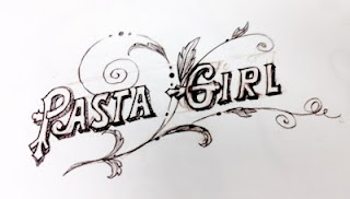
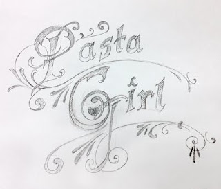
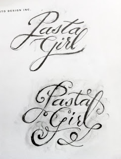
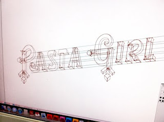
Here's a review of the creative progression of the logo as we continued through the rounds to the final design.
The first step was to concept a few hand-drawn type treatments:
After that, we scanned some of the preferred type to the computer, traced with the pen tool, perfected the lines, and chose the colors.
The next step was to add the type to the chosen graphic elements, designed by Tom Saputo and Georgia Lange.
Tada! The logo added to a packaging concept. It's still a work in progress, but it's almost there. We'll continue to update you on the Pasta Girl saga as the look becomes finalized.
Kinetic Type
Take a look at this amazing piece of animation by design student Jacob Gilbreath. It seamlessly combines the two best things on Earth: Conan O'Brien & typography.
As quoted by Gilbreath himself, "The concept behind this video is to show Conan O'Brien as a the monumental entertainer and solid wall that he is. Conan O'Brien is and will continue to be a seasoned television entertainer. After drawing inspiration from Lou Dorfsman's Gastrotypographicalassemblage, this concept was achieved by creating a literal wall from over 60 individual typographic layouts. These custom crafted layouts reference a variety of eclectic type design. The combination of eclectic typography and modern 3D letter forms achieved in Cinema 4D provides a contrast between old and new. This contrast emphasizes time to create a sturdy and timeless object. This solidity and timelessness is the perfect representation of Conan O'Brien."
Love it.
Wednesday, June 22, 2011
Bahaus
Monday, June 6, 2011
Amgen Foundation Annual Contributions Report
Thursday, May 12, 2011
Life by me.
Lifebyme.com is about sharing meaning. They ask one question to all sorts of people: "What is most meaningful to you?"
The idea is to connect with world leaders, moms, Nobel Peace Prize recipients, fishermen, teenagers, designers, prison inmates, media moguls ... you? Check it out here.
Monday, May 9, 2011
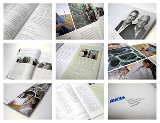
Amgen Annual Report 2010
This is the fourth year in a row we've collaborated with Amgen on their corporate Annual Report. It's a highly visible piece that not only communicates their progress to stockholders, but is also a great opportunity to provide an in-depth look into the company, its missions, values, and goals. So our approach, as with all of their projects, is to have a good understanding of what they're all about, and come up with a design that speaks to every aspect from research and development - all the way to helping patients.
Friday, April 8, 2011
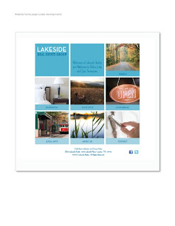
Lakeside Real Estate Group: Re-brand
Our objective was to create a real estate brand that feels contemporary, but still holds the traditional aesthetic value relevant to the southern community. We explored colors that would contrast the conservative look of the past ERA franchise; ERA's colors, process blue and PMS 199 red, are a trademark of 80's corporate America. We looked to the community, especially the blue waters of Lake Tellico and the red hills of the smokey mountains, for color inspiration. For the imagery, we simplified everything to evoke a sensory, emotive and natural feel.
Ultimately, we wanted the Lakeside Brand to represent a symbol of experience as a confident company.
We felt that this confidence should be reflected in all media touch points and visual communications, including Lakeside's website, brochures, business system and every form of signage. Here's what we came up with:
Monday, April 4, 2011
Wednesday, March 23, 2011
Tuesday, March 1, 2011
Who is Adrienne Ford?
Hometown: Agoura Hills, CA
Age: 20
Job at Saputo Design: Design Assistant
Favorite food: Pasta! All day everyday
What color do you identify yourself with most: Bright blue
Favorite animal: Puppies
What Mario Bros character are you: Princess Peach :)
Who are your heroes in real life: My dad
What makes you happiest: Sleeping in, eating, designing, laughing.
What do you like most about Saputo Design: The lack of having to use Microsoft Office... and everything else! I love working here- there are amazing people and interesting things to do.
Friday, February 25, 2011
Oliver's Big Snip
Good dog. TGIF?
Thursday, February 24, 2011
Tuesday, February 22, 2011
Wednesday, February 16, 2011
Interactive Monet Site
On our walls
Monday, February 14, 2011
Friday, February 11, 2011
Information Graphics, Beautifully
Wednesday, February 9, 2011
The Noun Project
Yes, this is real! Saving the world thousands of dollars in vector art, as well enhancing the world's visual language one silhouette at a time, The Noun Project is a collaborative effort to give free, fun, simple, and high quality icons to anybody who wants them. COOL!
Saputo Design: Thirteen awesome years
We started Saputo Design 13 years ago with the thumbs up from a client who liked what we did, and wanted us to keep solving creative problems. 15 years of getting things done at ad agencies all over the country gave us the confidence to tackle pretty much anything any client or agency creative director could throw at us. Oh, and a really big check helped too.